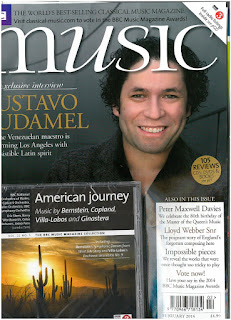
The other details in this front cover are:
- Barcode, bottom right.
- Body of texts, bottom right.
- Caption, middle left.
- Central image, middle.
- Codes, the model is wearing smart, formal clothes. The model seems formal.
- The serif font makes the front cover reflect musical notes.
- Dateline, bottom right.
- Headline, middle
- Pugs
- Freebie
- puff 'Reviews'
- Colour - grey, black and gold - this looks rich and implies quality.
- Four features are in a box on the right hand side.
- Lines are used.
How this has influenced me:
- I would like to use pugs. This would be to make the reader turn the page.
- I would like to give a free digital download. This could draw in a wider audience as the reader could like the music chosen. Also people would buy it as it is a free download in the magazine.
- I would like to use sans serif and serif font in my title as it would bring a variation by the serif font being recognised with the classical genre.

Evaluate why the things you have picked out are used and what effect they have. Also, try to apply theory.
ReplyDeleteAt the end of the post add a subheading 'How this has influenced my ideas and creativity'. Then respond to it.
ReplyDeleteI have now done that.
ReplyDelete